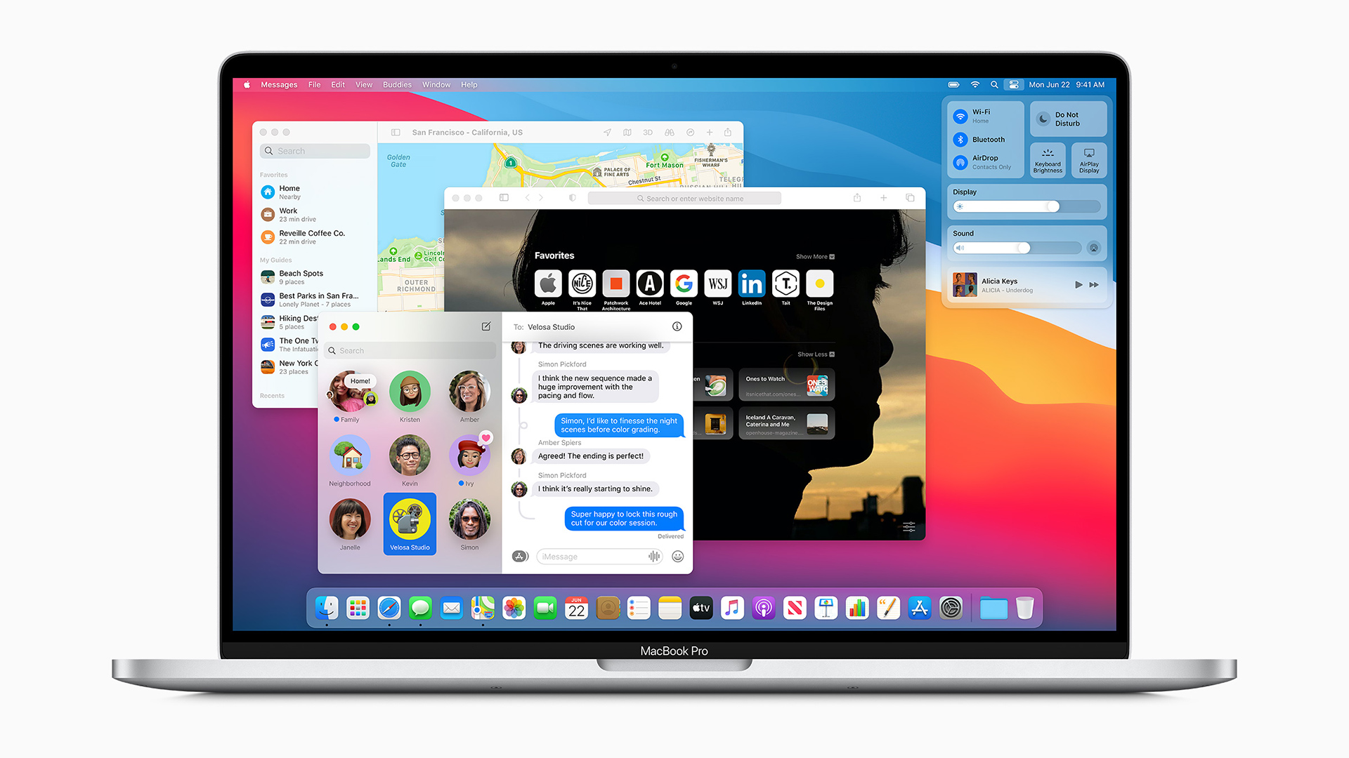
While the Intel-ARM transition was the blockbuster news of last week's WWDC20, it was far from the only news with significant steps forward for Apple’s entire eco-system.

macOS Big Sur. Image: Apple.
macOS Big Sur
At an event anchored by the platform’s Intel-ARM CPU switch, it was no surprise that Apple made macOS Big Sur a centrepiece presentation. Hyped as the greatest visual refresh since the launch of OSX in 2001, and notably labelled macOS 11 rather than 10.16, it was also in many ways a unification of the design language with iOS while still being Mac. Design VP Alan Dye contributed a stylishly presented video taking about new iconography within toolbars, greater space in drop down menus and even remastered audio effects. macOS looks cleaned up and refreshed, but also more iOS-like. The updated dock also presented refreshed app icons, with drop shadows within iMessages and FaceTime, to maintain a Mac distinctiveness for a platform oriented toward external monitors and 16-inch laptop screens rather than a 5.8-inch iPhone 11.
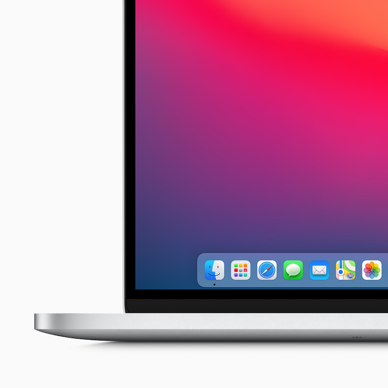
macOS Big Sur redesigned Dock. Image: Apple.
iOS’s Control Centre is also coming to macOS, but refined and enhanced. It’s neat trick how you can drag and drop a control into the top navbar. Similarly, Notification Centre is updated with grouped, interactive notifications and widgets that echo iOS 14 and iMessage is finally brought to apparent parity with iOS with features including Memoji.
Safari also got plenty of screen time. Now that even Microsoft has embraced Chrome with its Edge browser, the importance of Safari providing diversity is increased while the pressure is redoubled to justify its eco-system. Apple leaned heavily on it being the fastest desktop browser, 50% faster than Chrome for frequently visited sites, far more power efficient and of course Apple’s privacy focus. Apple are making it easier for developers to bring extensions from other browsers, but more closely manage their access - just like iOS apps, you can limit an extension to one-time access of permanent access. Other features such as a customisable start page with wallpaper, live translation of webpages and so on were Apple playing catch-up, but the privacy report is a nice feature.
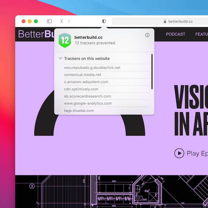
New Privacy features in Safari in macOS Big Sur. Image: Apple.
Underpinning many of these new features and apps for Mac is Apple’s cross-platform Catalyst frameworks, enhanced with much more control for developers to exploit. Both Apple Maps and Messages are flagship macOS apps and they’re now both Catalyst.
macOS Big Sur is available to download for developers today, for beta-users next month and will ship in Autumn. For some Mac enthusiasts, seeing the platform finally achieve closer feature parity with iOS/iPadOS might make the ARM transition worthwhile on its own, even if the price is a diminution of its distinct look. For the long-term, Apple is hoping macOS will pick-up the vibrancy of the iOS developer community, while iPad apps become ever closer to the capabilities of Mac.
iOS 14
It’s not yet renamed iPhone OS, as it used to be, but that’s what it is and this a significant refresh that even if not particularly innovative in its own right, swallows long-awaited features from other platforms to promising effect.
The ‘carefully considered’ homepage from the original iPhone has endured for well over a decade with a steady accumulation of enhancements and new features without every really diverging from the grid of apps look. At long last, this is changing with a variety of new UI features.
The App Library is hardly a original concept, but on iOS it provides a slew of convenient organisational features. More than simply listing all your apps, it automatically groups them into folders such as games and prioritises within folders those that are most used. It also has virtual folder for suggested Apps and Recently Added at the top of the Library. Many people have screen after screen of apps - with App Library you might have a page or two of your favoured apps and then completely hide all the other pages.
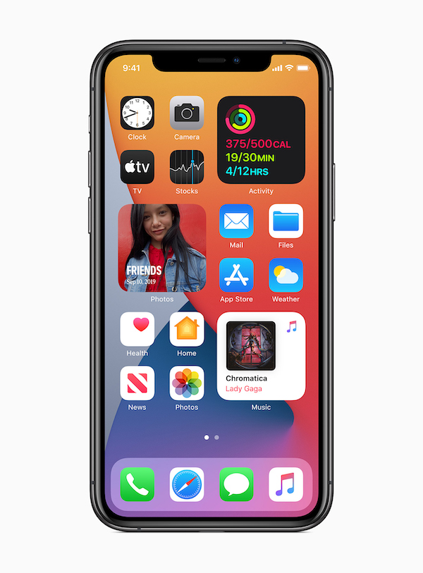
Widgets on iOS14. Image: Apple.
This is useful, but taken to another level with a rethink of widgets inspired by the flexibility on Apple Watch faces. Apps can have multiple different sizes of widgets, each dynamically refreshed and you can pull from the widgets screen to sit on your homepage. A ‘smart stack’ will allowing for layering of widgets so you can manually swipe between them, while the widget that appears on top could change during the day - morning news, work calendar during the day and then health activity summary in the evening. Android and Window Phone have been using widgets for ages, while iOS has until now prevented third-party apps from even showing a different calendar date. This is long overdue, but none the less welcome for that and we can expect developers to swiftly update their apps to support these functions.
Additional flexibility comes from iOS at long last supporting changing default email and browser apps. There’s also picture-in-picture video and an overhaul of Siri which no longer takes over the entire screen when activated.
We also get a new Translate app with 11 languages to begin with, including Mandarin and Russian, plus an emphasis on privacy using on-device translation and a conversation view showing side-by-side text in landscape mode. As of now, this app is iPhone-only.
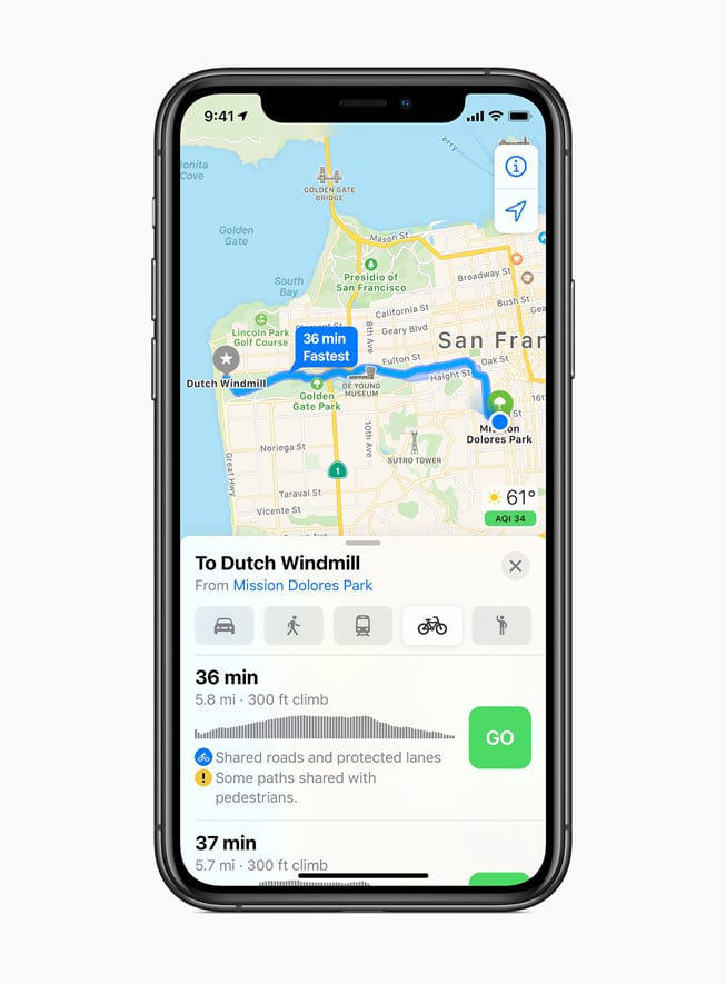
Maps in iOS14. Image: Apple.
iMessage also gets updated with pinned conversations, group conversations with inline replies and mentions, plus more Memoji personalisation. Apple Maps has been entirely overhauled with new data in the US, with a similar approach coming to the UK later this year. Similarly, cool new features headlined at WWDC20 such as cycling directions with a route’s elevation data and quiet/busy road info, plus electric car routing information, will debut with selected cities in US and China before being more widely available.
There will also be the option to use your iPhone as a key for a 2021 BMW 5 Series using NFC. One cool feature is how you can email a colleague with your digital key, even attaching limitations to usage - such as for a younger driver. This is part of a broader industry trend and Apple is also working to support open standards with a wider array of manufacturers.
Another neat feature are App Clips which are less than 10Mb in size and can be triggered by NFC, a QR code or a new NFC/visual icon developed by App. The idea is you might walk into a shop or restaurant, scan an icon and a mini-app will launch to provide limited functionality, a restaurant menu for example. Since Apple Pay and sign-in with Apple are fully integrated, you could also log-in and make a payment from these light weight mini-apps. App Clips can be easily discarded after use or upgraded to a full app later on.
Tags: Technology

Comments