 Apple refocuses on professionals
Apple’s WWDC 2013: "Can’t Innovate anymore, my ass!" Our Apple correspondent, K Stewart, reports that Apple is turning again to its core "professional" following, who have felt neglected recently
Apple’s 2-hour plus WWDC keynote was a powerful statement of intent from Apple for multiple target audiences, perhaps most notably the professional community who’ve grown increasingly restive after the botched launch of Final Cut Pro X in 2011 and only the most minor update to the Mac Pro in June 2012.
Includes humour...
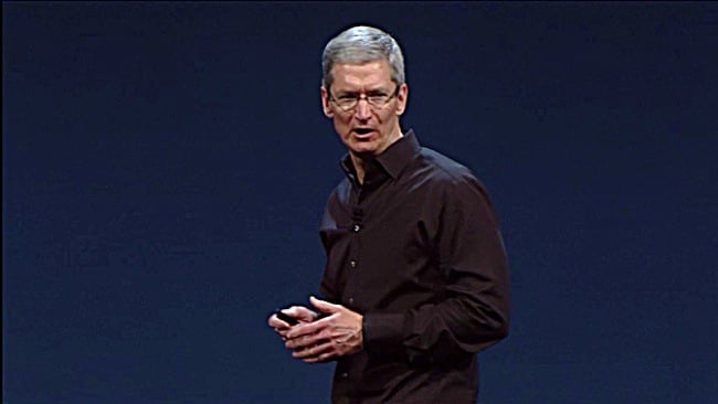
It was also a surprisingly funny presentation, with Software Engineering VP Craig Federighi taking multiple swings at skeuomorphism - ‘no virtual cows were harmed’ in production of new ‘faux leather’ free calendar app. Despite Apple shares being down 37% from last September, all the presenters looked upbeat and cheerful. Marketing VP Phil Schiller seemed on a mission to cram in as much technical jargon as possible in his presentation, not only to wow attendees with Mac Pro features but to add weight to his 'Can't innovate anymore, my ass' rebuff to Apple’s critics.
The well worn trope about Apple wanting to ditch the Mac and focus on iOS had little evidence here. Apple’s iTunes Radio service, which has been a popular pre-WWDC media topic, was presented with flair, but not given much more time than tabs and tagging features in Mac OS.
This was a keynote with a cohesive vision of an ever more tightly integrated eco-system of Apple computers and mobile devices. No hints about an iWatch or iTV, but plenty of substance to keep Apple’s existing product categories moving forward.
Mac OS X Mavericks
After feinting at Mac OS Sea Lion, Craig Federigh revealed a new naming schema intended to last for another ten years - California place names, beginning with OS X Mavericks. To be honest, for those not living in the Golden State, the surfing references got a bit wearying as the keynote went on but Tim Cook delivered the pay off with the ad which closed the keynote; the familiar ‘Designed by Apple in California’ is the company’s signature, its statement of what it believes in.
Put another way, Mac OS isn’t going away. There’s a ten year vision of a post-Steve Jobs Apple and Mac OS is a key part of that. Unlike iOS 7, there’s no bold new UI to get used to, but instead a mix of technical and functional changes to maintain its position as what Apple calls the ‘world’s most advanced operating system.’
Federigh chose to emphasise three key features. Tagging is supported when you save any document, enabling you to add or create tags which aid in search and are also pulled through in the side-bar with Finder. Tabs also come to finder (try XtraFinder if you can’t wait) and support for multiple screen displays is enhanced, including using an AirPlay enabled HDTV.
Under the hood, there’s technical enhancements to enhance battery life and system responsiveness. Timer coalescing focuses CPU calls to reduce usage by up to 72%, while compressed memory enhances how the system pages out RAM usage to disk space to reduce those moments when your £2K MacBook abruptly bogs down and you wish you were using an iPad.
Safari is also being polished with a similar focus. App Nap looked particularly neat in a demo, with a graphically intensive web page dropping to minimal CPU usage when a simpler page overlaid it. No more hunting through tabs to work out where all your CPU cycles are being consumed.
iCloud Keychain aims to enable easier sharing of passwords between Apple devices, plus automatic generation of strong keywords, storage of credit card information in a way very similar to what 1Password offers now as a powerful, but expensive set of Mac/iOS apps.
Apart from the first indicator of skeumorphism’s ouster, the Mac OS calendar app showed Apple responding to Google Now with lots of smart, contextual logic. Type Pizza as an appointment and local restaurants are suggested. Pick one and travel time will be added to your calendar, plus weather conditions. The iOS Maps app is also coming to Mac, making it easy to plan a route there and then send over to your iPhone quite seamlessly.
Another iOS app coming to Mac is iBooks. What took so long might be an honest question, but it was neat to see how well notes and study aids worked with an interactive text book. A Mac is never going to be the best device for reading the latest thriller, but for studying it could well give your iPad a run for its money.
Mavericks is due this Autumn, with developer builds shipping now. No price was announced, but Mountain Lion was the cheapest update yet at just £13.99. Affordability isn’t likely to be an issue then, but let’s hope supported hardware is expansive.
MacBook Air Update: All-day battery life
Before WWDC, everyone assumed a MacBook Air refresh was on the cards driven by Intel’s new Haswell CPU which seemed tailor made for the computers due to its power efficiency. Phil Schiller was careful to make the point Apple had worked closely with Intel to maximise the benefit of the new CPUs to achieve wake-up from sleep in one second, plus a 30-day standby time.
The new 11-inch MacBook Air will offer 9 hours operation compared to 5 for the previous model, while the 13-inch offers 12 hours operation up from 7 hours. The low end Air also storage double from 64GB to 128GB, while the 13-inch had a $100 cut from its US price. It will be very interesting to test Haswell Macs against Win 8 PCs.
In addition, the new MacBook Airs will feature 802.11ac wifi and this means new Airport Extreme and Time Capsule models designed to work with the standard. These will both also feature a new design, more vertical for better range. In a less packed Keynote, these might have been more than a passing mention.
Mac Pro: Be the guy with 3 x 4K displays
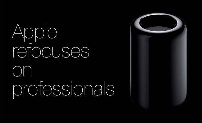
The ‘sneak peak’ kicked off with a teaser video that didn’t hold back in promising revolutionary change. The old Mac Pro lived up to Steve Jobs’ trucking metaphor for computers by basically being about the same size as a truck, a cavernous tower with easy access bays to hold a variety of expansions. The new Mac Pro is 1/8th the volume of the old machine, a 9-inch tall, cylindrical black aluminium design built around a ‘unified thermal core.’
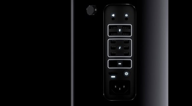
The Mac Pro will launch with an Xeon CPU with up to 12 core configurations, supporting 256-bit-wide floating point and PCI Express generation 3. It’s the first Mac to ship with dual graphics cards, specifically two FirePro GPUs from AMD - 384-memory-bit addresses for 528GBps total bandwidth. RAM will be ECC DDR3-1866 with a four channel controller for 60GB/s bandwidth. Internal storage will be flash, PCIe with 1.28GBps reads and 1.0GBps reads. All expansion is external with six Thunderbolt 2 ports, each port in turn capable of supporting six Thunderbolt devices.
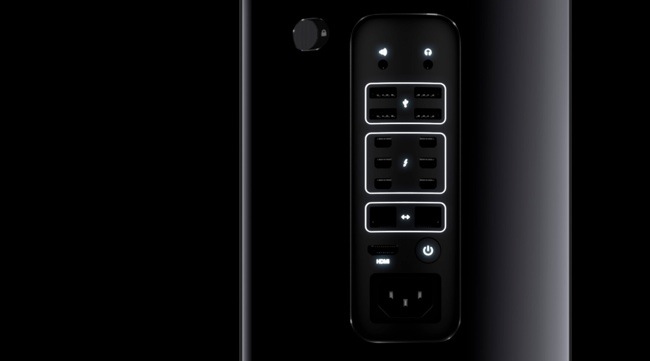
There’s also audio in and out, HDMI and Ethernet. In a nod to the old design, the top of the new Mac Pro is a handle, while a new feature is a motion sensor which triggers illumination of the ports when you rotate the device to fit new expansions.
All of which Phil Schiller deftly summarised with a picture of someone sitting in front of three 4K displays driven by a sleek, diminutive Mac Pro - “You could be that guy!”
No pricing information was released and availability is simply ‘later this year’, but the machine is on show at WWDC and a session featuring PIXAR will further demonstrate its capabilities. As Dave Shapton points out, on the face of it, since it can't run Nvidia graphics you can't use CUDA, which will be an issue with Premiere's Mercury real-time playback engine that leverages CUDA. It’s not going to trouble Final Cut Pro X users however, or Lightworks fans for that matter. [Update: We've just been told that the Creative Cloud version of Adobe Premiere uses Open CL, which works on both Nvidia and AMD. But anyone hoping to use an older version of Premiere might want to stick with older hardware as well - Dave Shapton]
Obviously, it’s unlikely to offer better performance per pound than a home-built custom PC, but it certainly brings Apple back into the game for serious graphics workstations. And let’s be honest, sometimes half the fun of cool toys is the look. Silicon Graphics workstations were distinguished by some fantastic designs and it’s good to see Apple offering something different and innovative. It’s been deeply involved with Intel in driving forward the Thunderbolt standard that offers so much potential for professional application, now it’s shown how it believes Thunderbolt can be best utilised. We can’t wait to get our hands on one and see how it performs.
For the moment, we’ll have to make do with an impressive interactive site at; http://www.apple.com/mac-pro/
iWork on iCloud (on PC)
The Mac Pro reveal was always going to be a hard act to follow, but there was a certain reserve in how the crowd reacted to iCloud’s latest iteration. Tim Cook made an intro that pointed out iCloud is the fastest growing cloud service, with 8 billion message sent, 7.4 trillion notifications. All of which doesn’t quite make up for the fact it’s something of a beast for developers to work with.
In part, this was Apple showing WWDC attendees what could be done with its iCloud and its premiere office suite. For the wider world, however, it was a little more intriguing. Microsoft Office has long been the foundation stone of MS’s business empire. When Steve Jobs returned to Apple, a key part of that keynote was Microsoft promising to support Mac with Office - despite the Mac’s then dire market share. It was a critical lifeline.
Microsoft has notably held back from offering Office on iOS devices however, and that may well end up harming Microsoft more than Apple, as its reputation as the ‘essential business suite’ is fading. Google, for its part, has aggressively pursued Office with its spartan, but collaboration-friendly Google Docs suite.
At WWDC, Apple talked up updates to iWork coming later this year for Mac and iOS devices, but the key element was an iCloud version that could work on PC via Chrome or IE. On Mac Safari, we saw Pages, Numbers and Keynote operating in a way very close to the native apps - including even an animated cube transition in Keynote in browser. The PC/Chrome demo showed masking of a picture in a document.
iWork has always been the most graphically impressive Office Suite, so seeing it run in a browser was a weird experience - particularly given how clunky Google Docs is when you get into any kind of elaborate formatting. If iWork on iCloud really lives up to the demo, then the PC market for consumer and low-end business (e.g. not Excel power usage) is about to get very interesting indeed. Developer access is open now, with end user beta access coming later in the year.
iOS 7: Rejuvenated?
While we can be reassured Apple’s heart is still in the Mac line-up, there’s no doubt the bulk of the profits come from mobile. At its launch, the jewel-like iOS icons perfect embodied a new age of touch screen devices and high quality screens which seemed relatively large in a time of ever smaller phones. Android’s initial response was simply to copy that approach, while Palm, Window and the new Blackberry UI have strived to move beyond it with live tiles and powerful, but not immediately intuitive gestures.
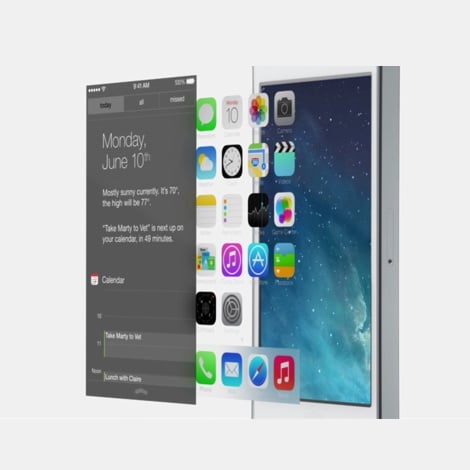
As expected, iOS 7’s new design has comprehensively ditched skeuomorphism with Craig Federighi pointing out, in another dig, Apple simply ran out of green felt for the ghastly game centre app. More than that though, there’s a use of translucency and layers to leverage the flattened interface to aid functionality. When you pull up the settings interface, you can see through it to the app that you’ve interrupted. On the homescreen, those people annoyed by the grid of icons obscuring their wallpaper may be pleased to learn they can tilt their iPhone for a 3D effect that exposes more of the wallpaper... Hmm.
More welcome is the fact that folder limits are now up to over 100, while the app switcher comes with a preview of each app as you swipe through them and you can move between apps via new in-app gestures. An upward swipes brings access to key functions, not just the music player but options to switch off wifi without digging through multiple sub-menus. Notification centre has been strengthened with more functionality and is available from the lock screen. Multi-tasking will be made available to all apps, while the OS will monitor your usage patterns - so if you use Facebook frequently, that’s prioritised for updates - while CNN might be prioritised only in the evening if that’s when you tend to check news. Senator John McCain’s much publicised complaint about endless App updates will be answered with background updates.
Airdrop will make it easy to share files with people nearby on iOS 7 - a Mac OS feature going to iOS for once - and SIRI will be enhanced with more voices, more information (from Twitter, Wikipedia and... Microsoft’s Bing search - although in Safari, Google remains default).
Photos are getting a lot of attention with smart grouping of photographs by location and date, even offering a year by year grouping of photos that can be scrubbed through and selected. Sharing by photostream is to be made easier and more customisable.
iTune Radio will initially launch only in the US, free with ads and free without ads for iMatch subscribers. The customisability of the ‘radio stations’ makes you wonder if many people will ever need to buy music again.
It was a lot to take in as Apple strove mightily to prove this was the biggest change to iOS since the iPhone’s launch. How well Apple has found the balance between innovation and a new design, while keeping its existing customers happy, will become evident this Autumn when iOS will ship - the developer version is available now for iPhone, with iPad following in a few weeks.
Designed in California
Overall, this was a convincing keynote - the Mac line-up, spearheaded by the Mac Pro, and buttressed by new MacBook Airs plus worthy updates in Mac OS Mavericks, looks stronger than ever.
For mobile, iOS 7 is a promising freshening up of the OS and an intriguing preparation for not just the inevitable iPhone 5S but also the much rumoured, plastic bodied lower cost iPhones. It will take time to get used to the design, but at least it’s freshened up and shows forward movement to make sure the safety and simplicity of iOS also remains competitive for power users.
Tags: Technology


Comments