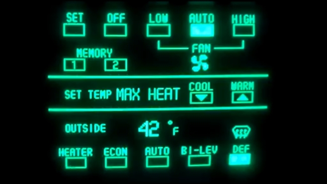
 Buick Reatta GUI
Professional camera GUIs seem stuck in time. Isn't it time for a radical change?
Have a look at this amateur video of a car produced in the US between 1988 and 1991. It was a car with a touchscreen!
It's quite impressive for the time, not necessarily for the touchscreen, which is obviously a very early example, but for the granularity of all the things that it can control.
Even so, it's very easy to sneer at it and to compare it with modern tablets and touchscreens, which are very obviously much more advanced. Thank heavens we don't have user interfaces like that any more!
Except that we do.
Stuck in the previous decade
A very high proportion of cameras have an interface that looks like it is stuck in the previous decade or two. It just doesn't seem right that our expensive kit has to have an interface that looks like the control panel from a 1980s microwave oven.
But, aesthetics aside, do we really need prettier menus?
Well, you don't need menus to look sexy. But we have at our disposal today much better GUI technology; very much better.
But is it appropriate?
The trouble is that when you see an interface with cheerful, colourful icons, your first reaction is probably going to be that it's a consumer product. This just wouldn't look right in a professional device.
So does that leave us with terse, text-based menus? (I've always disliked the idea of simply applying a touch input to plain old textual menus).
The way that menus are organised
Well, it's not that they're text based, it's more the way they're organised.
I have a particular gripe with this but one that's not altogether justified because I'm a bit of an idealist.
What, I presume, most professionals need is consistency rather than beauty in their menu systems. They want to see related things nested in the same menus - across multiple cameras and even manufacturers if possible.
What I would like to see is more akin to the way that directors think. They should be able to describe a scene and the camera should be able to assign settings that achieve this.
Except that this sounds like we're back in the domain of consumers again!
And, wouldn't this also leave the camera in the position of making artistic decisions - or at least putting its own interpretation on them?
But it needn't be like that.
Fast paced and moody
If, for example, you were to tell a camera to make a scene look fast-paced and moody, it might set a very fast shutter speed, turn up the contrast, and desaturate everything. Or, on the other hand, it might set a low shutter speed, turn up the saturation and lower the contrast.
This might get you somewhere into the region of what you were trying to achieve. And then you could just "fine tune" things by "telling" it that you want a bit more saturation, or perhaps some ND filter.
If this sounds ideal, there's a flaw. Which is that there are so many fine tuning adjustments that you could, or probably would, want to make, that you will still have to have a pretty good understanding of the lower level functions of the camera.
All of which brings us back to the menu system. You'll be exposed to this whatever happens.
What's the answer to this?
User interfaces can be improved
I'm sure that user interfaces can be improved. They don't have to be so terse, or as inaccessible. I'm sure that there's a sense in which "professional" is taken to mean "hard to operate" by manufacturers in a tacit understanding with their users.
What I'm not sure about is whether this will ever change.
I do think that some new cameras like the Blackmagic ones have - perhaps inadvertently - taken steps towards the ultimate interface.
What you get with a Blackmagic camera is a very simple menu without very many options. That's hardly surprising because although these are fully-functional cameras, they record RAW video, which means many of the normally in-camera settings can be adjusted in post production. But they also have an almost elegant simplicity to them that I wish we could see elsewhere. What they don't do is answer the question about how you can bring full control capability to a camera that does have complex adjustments and options.
So, no real answers to be found here. I'm really just interested to see what people think. I personally don't really like using touchscreens. I do think that voice has potential for professional interfaces - or even gestures (for when you have to be quiet on set!).
Or maybe, ultimately, theres a very good reason why user interfaces are they way they are. Perhaps there really is no good, reliable alternative. What do you think?
Tags: Technology


Comments