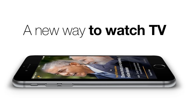
 A new way to watch TV
A slick new app points the way to how we might watch TV in the future
If my family are anything to go by there's been a massive shift in TV viewing habits over the last year. Nobody watches TV in real time any more, apart from news and sports. Everything else is watched as a download (or streamed from a service like Netflix or Amazon Video). Everything.
We even have earlier bed times, because we want to get to our iPads and Kindle Fires as soon as we can to begin the evening's viewing.
While this may be terrible for society and the family (I'm not sure that it is, by the way, but that's another argument) it does mean that the median quality (as measured by satisfaction) of our viewing has gone up. That stands to reason because we have a better choice over what we watch. And we can view it when we like.
So while this is good for content creators (not least because they get revenues they would have missed if it weren't for the second and third chances that viewers have to see their material), it necessarily follows that it is bad for scheduled TV viewing (I call it linear vs non-linear viewing).
Now, there's a curious hybrid. I'm not sure what it means, but it feels like it might be big. It's personalised viewing, with a pseudo schedule built up around user preferences. There's a slick example of it now available on the IOS App Store and it's called Reuters TV
It's a news app, of course, but what it does is ask you how much time you have to see todays updates. If you choose five minutes, you're presented with a very slick, perfectly timed sequence of news stories.
First, there's a voice that tells you "It's five thirty two and this is Reuters news". And then you're eased into a very good-looking segue of news packages. It's smooth and professional all the way down to the transitions between the stories. It's as if you have your own production room working just for you. Before it starts, you tell the app how much time you've got (5 minutes or 15 for example) and the system puts together a sequence of items that fits exactly into that time, prioritising the important stories.
The content is good but the presentation is almost breathtaking.
I don't know where this is leading but it is going to lead somewhere. With more user input this could become the Zite or Flipbook of news and probably beyond.
There's a free trial and it's well worth seeing it for yourself.
Tags: Studio & Broadcast


Comments