
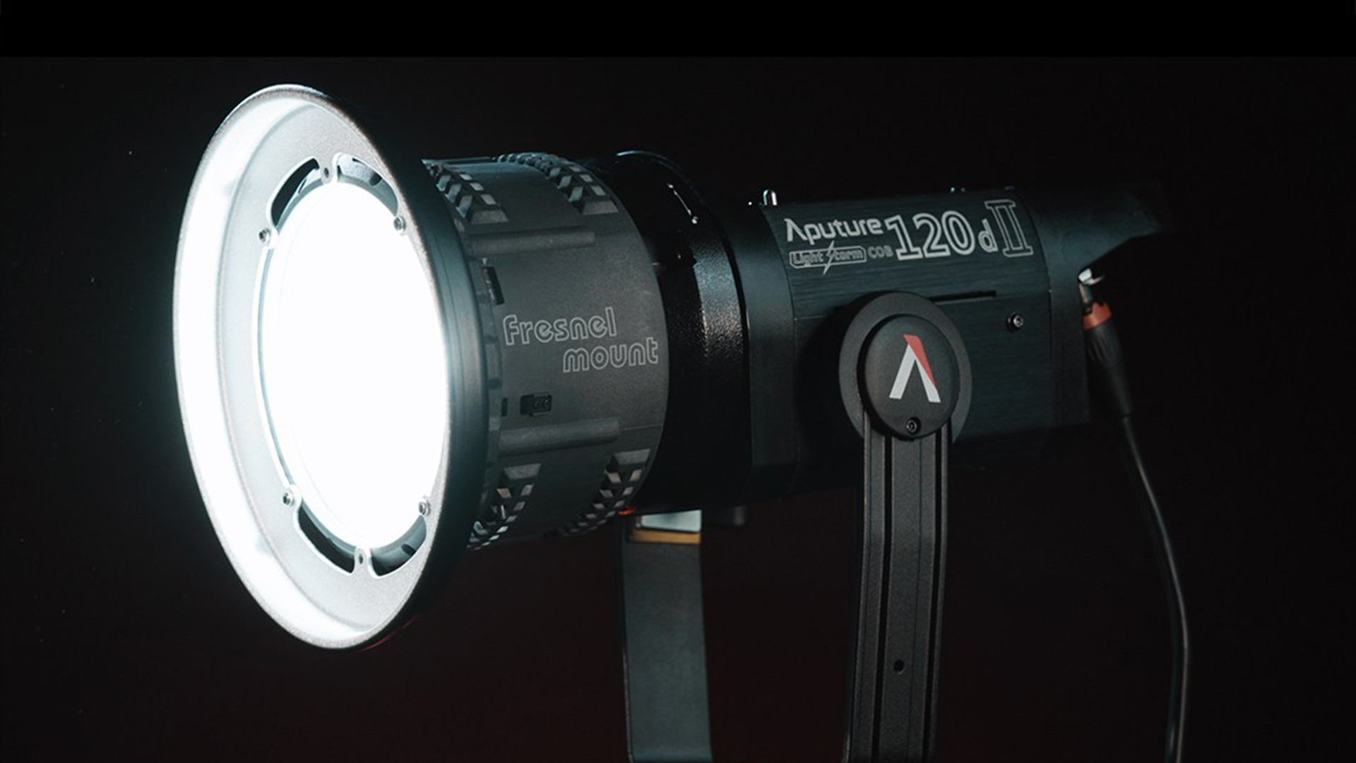
Wouldn't it be great if there was a really consistent and accurate way to assess different film and video lights? Unfortunately it's a highly complicated problem. Here's why.
There seems to be some controversy over how we should be assessing lights. As every schoolchild knows, the most important thing about standards is that we have the widest possible selection of different ones to choose from. That’s the situation we’ve ended up with in colour quality systems for lighting, with CRI, TLCI, TM-30 and SSI all vying for acceptance. CRI is both the most widely recognised and the one that makes more or less every product look good, so there’s an unfortunate tendency to use it regardless of how accurate it is.
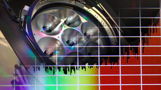
The giant HMI cluster in the background actually doesn't have brilliant colour quality, but most people understand how it behaves
But this isn’t going to be about which one’s best. To clear that up, at this point, we might as well go with TLCI because it’s far better than CRI and has achieved at least some acceptance. The problem is, all of these things (with the exception of parts of TM-30 and arguably the standard presentation of TLCI) often try to express how good a light is as a single number. It’s a really nice idea and an easy promotional tool, to be able to state two scores and demonstrate that one thing does better than another thing. Sadly, that is, as with so many attractive ideas, a little misleading.
Here’s why.
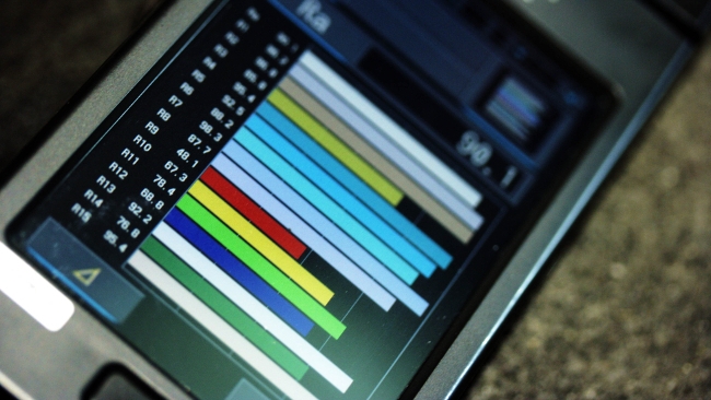
It's difficult to express a (bad) spectrum like this, shown on the Sekonic C700, with a single number, much as it's hard to describe the profile of the Alps with a single number
Human eyes can see wavelengths, depending on the individual, from about 380 to 740nm (some sources say a little more; perhaps up to 1000nm, a super-deep red, under the right conditions). A decent pocket colour meter will output a measurement every 5nm, for a total of something like 72 readings over the visible spectrum. Most pocket colour meters of the type we use while wandering around international trade shows don’t literally sample every five nanometers; that would ideally require 72 different detectors behind 72 carefully-made filters.
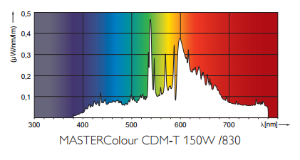
This image, distributed by Philips, shows the spectrum of a ceramic metal halide light of the type often found in retail premises. The 8 indicates an 80-something CRI - not pretty.png
If we wanted that sort of precision, we’d use a lab-grade piece of gear using a completely different principle, but that’s not the sort of thing you can slip in a pocket and take to NAB. Most pocket devices use just a few sensors behind a few filters and interpolate the rest using clever mathematics. That’s not ideal: 72 samples across the entire visible spectrum isn’t that many. The difference in colour between two adjacent samples might be visible.
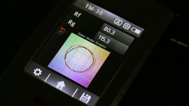
TM-30 does actually work pretty well, with the circular plot indicating where the test light source (in red) may be deficient compared to an example (in black).JPG
Even so, 72 samples are enough to describe a pretty complex spectrum. It could have almost any shape, almost any combination of peaks and troughs. Some real-world light sources are that complicated; we’ve all seen graphs of fluorescent tubes and LEDs. Yes, we can express how good a white light source is in an incredibly general sense, but that doesn’t really tell us anything about exactly how it might look wrong. One poorly-scoring light source might lack yellow. Another might lack green. Both might score the same number in at least some of the colour quality systems we’ve seen, but they might look completely different, especially on camera and especially when used to illuminate brightly-coloured objects.
So, sorry about this; there is no one true way to evaluate lighting, especially given that cameras all have their own idiosyncrasies with colour. More or less the only way to figure out whether a specific light will illuminate a specific object so that it looks good on a specific camera is to get that light, that object and that camera into the same room and try it. Systems like TM-30 try a little harder to show us what’s going on, displaying a circular plot of an example light source, with the light source under test superimposed. It’s a useful system and might show how any two light sources compare, but it doesn’t tell us anything about how that might interact with a particular subject or with a particular camera.
There are better ways to express the quality of a white light source, and there are worse ways to do it. There is no perfect way to do it.
Tags: Production


Comments