
 Difficult to pull off, but not impossible...
There was a time when we could choose between a whole selection of film stocks from at least three different companies — negative, reversal, black-and-white, not to mention post tricks such as bleach bypass. To some extent, we can still do those things, but this raises an awkward question: why can't I press a button on my digital camera to make it shoot black-and-white? Or something else?
Actually, you sort of can do this. A bit. Some DSLRs will do it, as in Canon's Picture Style options, and Sony cameras often have broadcast-style paint and colorimetry tweaks. What they generally don't have, is a selection of looks like the selection of film stocks we used to (and to some extent still do) have. It's something we get, to an extent, by choosing different cameras. When the ACES standard was designed, the camera manufacturers were at pains to ensure that it wouldn't seek to make all cameras look the same (and it doesn't.) Even so, it doesn't feel like we're taking best advantage of the technology.
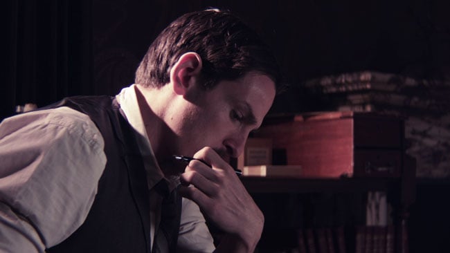
What would we call this - period warm with shades of oak, perhaps
If the idea of selectable looks sounds alarmingly like a set of potentially cheesy, Instagram-style looks, well, there is that risk, but the intent is that we're only talking about what we always had with film stocks. The rest of it is about good taste and implementation with the understanding that subtlety and quality are key. Right now, you're stuck with loading a lookup table into the camera (if it will) or the monitor (if it can) and have the same thing done for the offline copies (if there's time) and the grade (if you trust that the information will get through that far). It works on paper, but anyone who's tried this will be fully aware of how beset with problems it can be, particularly if you aren't the director of photography, the editor, and the colourist. And let's not pretend that every frame of everything that goes out ends up going through Resolve. It may be free, but time isn't.
This is also about reliability. Throwing together some cubes based on test images in Resolve is easy and applying them during production is often not an insurmountable obstacle. It is actually quite difficult to do that in such a way that's reliable in a wide variety of lighting situations, with extremes of exposure or colour balance sometimes interacting unpredictably with a LUT in a way that wasn't revealed by the test image. It's usually nothing any reasonably competent person couldn't handle, but there are a time and equipment and therefore a cost penalty to this which can mean problems can sometimes occur.
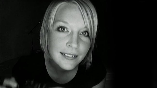
What happens in monochrome stays in monochrome
It's also easier to persuade people to use tricks like this, which have, in effect, been signed-off by the camera manufacturer. If it were possible to select a bleach-bypass look branded by one of the luminaries of the industry — say Kodak or Technicolor — that would make it a far, far easier sell in terms of the paranoia of producers and post-production people. As evidence of this, consider the fact that Technicolor's CineStyle picture style for the Canon EOS series DSLRs was very widely used in spite of having been intended for a very specific situation that most of the people who used it weren't experiencing. It was essentially a logarithmic setup which wasn't particularly well-suited to recording on heavily compressed camera systems such as a video DSLR. It wasn't really a great solution outside the very specific situation of using one as a crash cam on a Technicolor-posted show, but as such it's a shining example of the fact that the name matters.
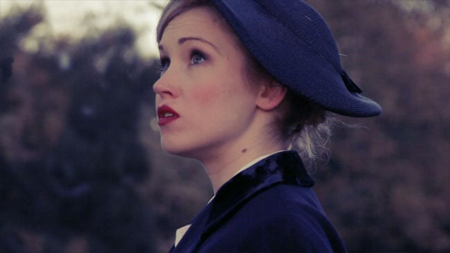
This sort of thing is difficult because the background is a sort of murky brown-green, but we can easily help the skin tones stand out
So, let's assume we have the name and some competent engineering. Let's also make the rather more adventurous assumption that users will be aware that taking a lush, tropical location and selecting the cool blue picture style will not make it look like the Arctic. Production design, as ever, must work in concert with camera technique. How would this work? Well, the purpose of it is to give us a more approachable user interface than we've previously had — anybody who's tried to achieve anything artistic with the matrix setup on a Sony camcorder will sorely and simultaneously be aware of how powerful and how tricky it is. So let's have a series of presets much like we have glass filters. Let's call them grown up things like “cool 1” and “warm 4” and even things like “high contrast” or “bleach bypass.” Of course, we need to be careful that a minimum of information is lost in this sort of process, and high or low contrast shouldn't clip or pedestal things, regardless of whether we're baking this look in or not, but that should be basic competence.
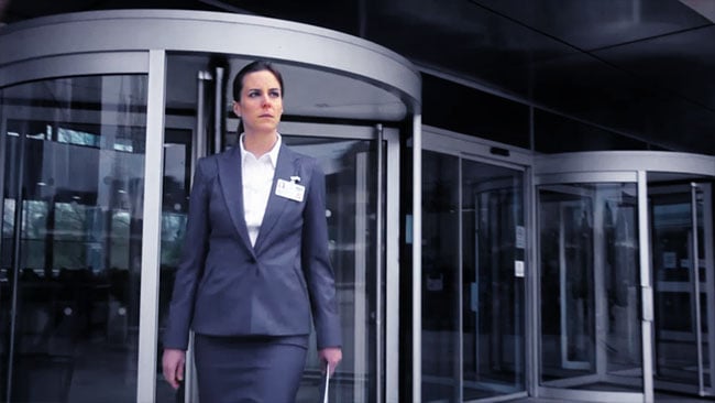
The wardrobe and location combine to make a cool look work here; fighting this sort of thing is ill-advised
One important factor — not to say prerequisite — of this sort of thing is a way to pass this in-camera decision along to post-production in ways that are better than we now have. Yes, let's be clear, we want the ability to burn the look in, just as we can shoot Rec.709 on an Ursa Mini, but we also want a completely reliable non-destructive transfer of our selected LUT to post. This is a holy grail of post-production engineering at the moment and often involves a lot of manual messing about. It's hard enough even to find a nonlinear editing system which will handle every extant file format, let alone one which supports the sort of metadata we're talking about. Certain combinations of gear can do this, but this is certainly a situation where the emergence of a much more universal standard — almost any standard, really — is probably more important than the precise details of that standard.
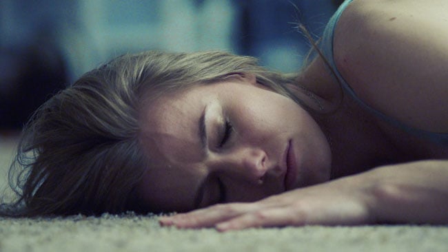
Cool blue shadows may require three-dimensional lookup tables, but modern hardware can handle it
One day, perhaps.
Tags: Production


Comments