
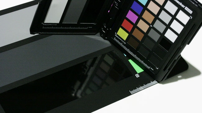
 The deep black chip on the ColorChecker Video is gloss, to produce a deeper black.
Phil Rhodes takes a look at X-Rite's modern, pocket-sized update on the classic Macbeth chart, the ColorChecker Video Passport.
X-Rite has been supplying colour charts for years, including the famous Macbeth chart, as held by a thousand pairs of hands before the first shot of the day. Given the long history involved, the decision to update the chart series might be looked upon as a little daring, but this is nonetheless X-Rite's intention, as announced at IBC this year.
Designed for today's video cameras
As we discussed in our post-IBC coverage, having enjoyed a brief sneak preview of the new charts at the show, the idea of the ColorChecker Video is to update the Macbeth chart for modern cameras. To be fair, it wouldn't be particularly difficult to create a chart that made more objective technical sense than Macbeth, since the colours on that chart were always fairly arbitrary. The original Macbeth chart includes a greyscale, and there are primaries and secondaries, and there are flesh tones, but none of them are specifically designed to appear in any particular way on any particular piece of test-and-measurement equipment. Not so with the new chart, which includes primary and secondary colours which are intended to sit 60 degrees apart on a vectorscope, as well as an expanded set of skin tone references and a longer greyscale.
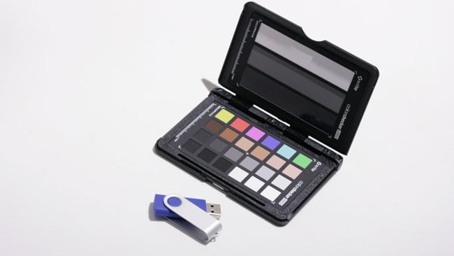 The pocket-sized ColorChecker Passport Video with USB key for scale
So much for intentions; let's look at the charts X-Rite have sent out. The pocket version of the ColorChecker comes in the plastic wallet-style case, which should be familiar to users of previous ColorChecker versions, and includes a grey surface for white balancing, a Siemens star for focus checks and a white, grey and black step set alongside the new colour patches. The full-sized chart has the patches on one side and a white balance card on the other, a refinement that my Macbeth chart lacks.
The results that most people will actually see from these charts vary depending on the camera you point at them, which is probably the point. The intention is that – in extremis – one could use the advanced paint and colorimetry settings in a camera (or the controls of a colour grading suite) to normalise things according to the chart. It's necessary not to get too carried away with this, inasmuch as theoretically correct isn't always right for a particular project. It's probably no coincidence that the chart is referred to as the ColorChecker Video. It'll be very at home, I suspect, on broadcast shoots where there may be a need to match disparate cameras – and a vision engineer sitting in a truck ready to do so.
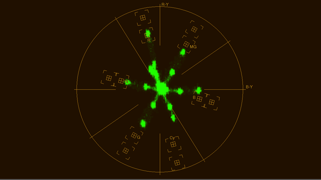 The six primary and secondary chips appear in approximately the right vectors as shown here.
This camera could do with a tweak. Deliberately underexposed for clarity.
A new standard?
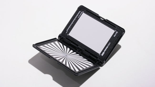 The ColorChecker Passport Video retains the traditional Siemens star for focus checks and a white card for colour balance.
Whether it'll replace the trusty Macbeth chart on single-camera drama is another matter. It certainly offers more than the Macbeth technically, so it's very probable we'll see both in use at once, leaving a poor, unfortunate camera assistant juggling even more pieces of cardboard in front of the camera during those start-of-the-scene setups. There's also the question as to whether dedicated white balance surfaces are really necessary; I mention this only because it's an inevitable observation among crew when these subjects come up. Do we really, absolutely need a precision white surface to balance on? Well, no, probably not; people have made a living while using far coarser approaches, but there's absolutely nothing wrong with getting things as right as possible.
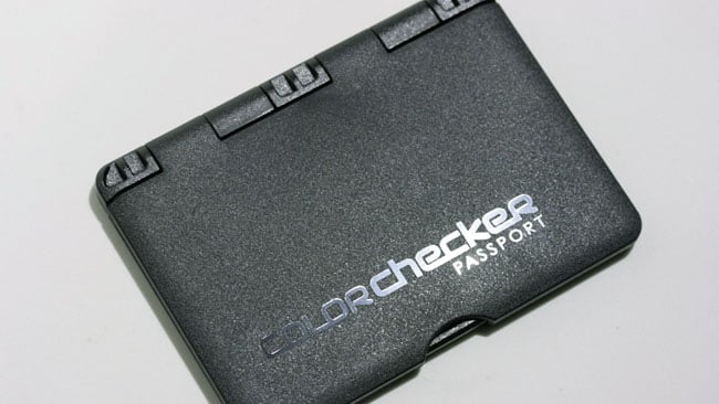 The Passport version retains the handy pocket case.
Real chart-and-vectorscope enthusiasts will indeed be enthused by X-Rite's new charts. The pocketbook ColorChecker Passport Video runs at £126 and the full-size chart is a little cheaper.
Tags: Production


Comments