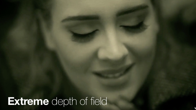
 The music video for Adele's single 25
It's not all about the flip-phone. The music video for Adele's new single, Hello, takes depth of field trickery to the extreme.
Who would have thought that the release of Adele's latest album, predictably called 25, would be accompanied by a video that is a textbook illustration of how to use (and even abuse) extreme depth of field to good effect.
It's all a matter of taste, of course. You may think this is syrupy and schmaltzy, but I think it does hold up as a 'thing in itself', which is what a music video is.
The choice of monochrome with a slight sepia/greenish tint (at least on my monitor!) gives it a very organic look. It's a very easy way to invoke feelings either about now or the past; but, it looks warm, too – much more so than if it had been strictly black-and-white.
Some of the shots in the video have an extremely shallow depth of field. At the very start of the video, we see a shot of a window pane. Only the front of the window sill (the part closest to the camera) is sharp. Then, the focus moves to the glass itself and, ultimately, to the scene outside the window. In another shot, immediately following the start of the actual song, the camera pulls focus through the window in a kitchen door, landing on a kettle on a gas ring. It almost has a grammar of its own.
Later in the video, Adele's face is shown in close-up. As she moves backwards and forwards, at times she's completely out of focus. But that's okay here, because this is less of a portrait session than a shared experience. Making the viewer share such a narrow depth of field is a powerful tool towards empathy and intimacy with the role of the actor.
It's pretty amazing to think that this could have been made with cameras and software that cost very little. All you need is copious talent, which came in this case from Xavier Dolan, a Quebec native with several feature films to his credit.
What do you think? Is this a banal pop video or a work of art?
Tags: Production


Comments