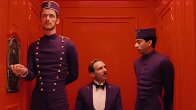
 Grand Budapest Hotel
The Grand Budapest Hotel proves that you don't need to rely on CGI to create a fantastic - or fantastical - look
I recently wrote about the Golden Globes winner, Wes Anderson's Grand Budapest Hotel. We liked the use of colour and the overall look and style of what was in just about every way a very good film.
But when I wrote this, my assumption was that, as is very common these days, the hotel interiors and exteriors were mostly CGI. After all, it's a very distinctive-looking hotel and, especially in its early 20th Century guise, it would be hard to imagine a real hotel looking like that. After all, The Great Gatsby, which had a similarly fantastical building at its core, was almost all CGI.
And the same applies to the interiors. You just don't see hotels like this now.
In fact, despite an East Europe-wide search, no suitable hotels were found. Eventually, the film's researchers (who included Wes Anderson) found an old department store. Abandoned and dilapidated, it had the potential to be turned into a grand hotel. And not just one hotel, but the original one in the story from the early part of the last century, resembling nothing much less than an ornate wedding cake, and the more prosaic 1960s version: shabby and well on the path towards ultimate demolition.
They fitted out the department store so that it looked every inch a fine hotel, but first, they had to shoot the 1960s version. For this, they built an inner shell decked out to look like the more the latter-day hostelry. And then, when they were done, they just stripped it away to reveal the splendour of the earlier hotel.
I'm pretty sure that some CGI was used in the film, but, most of the time the film looked like it did because that was what was in front of the camera. To quote RedShark's Technical Editor, Phil Rhodes: "If you want your scene to have a green "look", fill it with green objects".
Tags: Production


Comments