
Changes are afoot. Avid's Media Composer has undergone some major changes, and it's not before time.
Being an almost thirty-year industry incumbent looks attractive from the outside. Avid' products are used on the best production by the best people and often chosen as a default; nobody ever got fired for specifying Media Composer or Pro Tools, both of which enjoy an enviable level of recognition and popularity. At that level, though, users become habituated to software as a tool for a job; use something for decades and change tends to attract awkward questions unless it’s very, very well justified. And that's fine: it's like asking a virtuoso violinist to play left-handed. That’s also a problem, though, because it becomes difficult to make even quite necessary changes without provoking the ire of that experienced userbase.
Interface changes
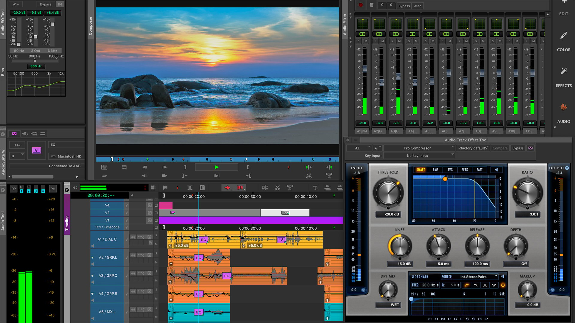
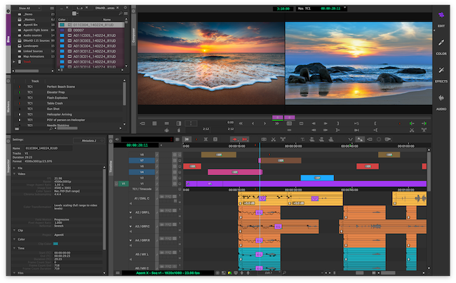
NAB 2019 is therefore noteworthy as the time that Avid made major changes to the user interface of Media Composer. In some ways the changes are quite pedestrian: the program now offers much more user-defined layout, something that’s been available in competing software for quite some time, but in such a specific niche as Avid occupies it’s actually quite a daring thing to do. It’s possible to configure the new UI to more or less duplicate the old one, but that isn’t the default, and new users will see the new layout first.

That’s doubtless by design: the classic layout was rather visibly, um, classic, quite clearly representing a lot of revision and addition to a rather historic original layout. And that’s the dilemma for a company like Avid: keep the old guard happy, or keep the new blood flowing in. It’s probably not possible to please everyone at once, though a user-definable layout is probably the closest it’s possible to come to being everything to everyone. In any case, the current version of Media Composer with the old UI will continue to be available for a while, though it will not receive new features.
User advice
Avid also appears keen to take user advice, with several new features noted as having been suggested by its customer association. This, too, is a double-edged sword: everyone who’s ever used any piece of software will have a list of tiny changes they’d like made which may each be of interest only to a few people, and it’s important that a software house doesn’t become distracted from any sort of broader strategic consideration by a storm of small, individualistic changes. This seems well-handled in the case of Media Composer. New capabilities include an expansion of the marking and annotation tools in the associated web app, designed for directors and producers to comment on footage or edits. Perhaps more significantly, there’s a new ability to use other computers on the local area network to help out with tasks such as transcoding or rendering; that's a good route to parallelism and a very cost-effective way of making things happen faster.

Perhaps it would have been nice to see that go further, and involve cloud computing for more scalability. Updates to Avid's Nexis storage system does offer some cloud capability, for storage rather than CPU resources, with what the company calls “cloud spaces” alongside the familiar local Nexis storage configuration. There are concerns with this: anything sent to cloud storage must travel over the internet, which in many cases will become a significant performance bottleneck for data as large as typical video footage. Still, the sheer scalability of it will doubtless attract people with big, capable network connections; it’s designed to operate in almost exactly the same way as Nexis and therefore has more or less a dead flat learning curve.
Pro Tools future
Chatting to Avid people after the event, it’s hinted that Pro Tools might be next in line for a user-interface revamp. That'll be no surprise at all to anyone who’s looked at the Pro Tools user interface recently; again, it has many adherents of long standing, but it could hardly be a better example of a well-loved piece of software that’s had lots of new features stuck on with duct tape and crazy glue. And again, this sort of change will inevitably provoke howls of protest from the very experienced, but, as we’ve said before, it has to happen: stagnation is what created these historic UIs in the first place, and at some point the nettle must be grasped. Avid seem happy that their changes make things easier, and having had a very brief play it's easy to agree.
So, chin up, old-time Media Composer users; it’s short term pain for long term gain. And if you’re a new user, it's all very welcome indeed.
Tags: Post & VFX


Comments