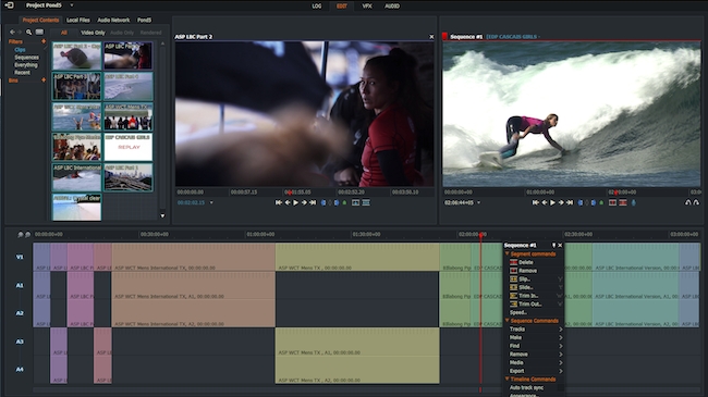
 The new Lightworks UI aims to be more intuitive for new users
Deftly avoiding any superstitious sensibilities by jumping directly from version 12 to 14, the new version of Lightworks comes with a new user interface.
A new Lightworks beta always causes a frenzy of downloads and no more so, we predict, than with the new version 14, which sports a new UI.
Now, before you start getting out your scientific instruments to see if the Earth has stopped turning on its axis, it’s important to say that this new UI is in addition to, rather than simply replacing the old one. So existing users have nothing to worry about and everything to gain.
The new visage is there because feedback from the astonishingly huge number of people who have downloaded Lightworks over the last five years has suggested that the old interface wasn’t exactly intuitive. That was OK in the days when Lightworks sold as a turnkey system for upwards of $40,000. For that type of investment you’d expect to spend a bit of time learning it, and when you did, it really flew.
Todays landscape is different. Lightworks is now largely free, or available for a variety of very low payments if you want to be able to output it in 1080 or above. So the number of new users is almost incalculably larger than in the old days before it became a software-only product.
I’m told that the new UI has been designed with accessibility in mind, without losing any functionality. There’s more of a flow to it, and important functions are where you’d expect to see them, based on your experience of modern UIs.
The new “fixed” layout starts with four tabs along the top: LOG, EDIT, VFX and AUDIO. Clicking on these takes you to dedicated pages for those areas of functionality.
LOGging allows you to enter and edit metadata that will be useful throughout the whole post production process. You’ll also be able to set in and out points that will apply when you select a clip for use in your project. The EDIT tab takes you into a familiar-looking timeline editor with source and timeline windows. Each of these has a set of controls for moving around the clip or timeline, and the usual Insert and Replace tools.
TRIMming - always powerful in Lightworks - seems much more intuitive in the new version, with simplified graphics representing the usual trimming modes.
All the VFX are there, and some are applied to a clip by default for immediate access (although set to zero so that you can ignore them if you want to).
We think this is a major leap forward for Lightworks because these changes are going to make it more likely that new users will understand and want to work with this powerful NLE. Existing users can try the new UI, reassured that if they don’t feel at home, the “classic” UI is still there.
Note that while there’s a superficial resemblance between Lightworks 14’s new UI and Editshare’s Flow Story remote editing product, Lightworks 14 does not have the same ability to work remotely, nor to integrate with Editshare’s Flow database.
You can download the software from here: www.lwks.com/downloads
Here’s the full list of improvements in Lightworks 14:
- New Fixed layout interface
- New voice over functionality
- Added proxy workflow (create proxies directly from a clip or bin)
- Audio Network integration from directly within the application
- Pond5 Integrations from directly within the application
- AVID DNxHD MOV encoding (AVID DNxHD license required)
- Ability to Play, Scrub and Mark clips in List view bins
- New import panel functionality, play clips and mark only the section you need
- Easier varispeed handling and appearance (fixed layout)
- Streamlined timeline editing for more streamlined appearance with new right click segment commands
- Fullscreen preview playback controls
- Background import for Copy local and Transcode options
- New auto effects functionality
- New project browser with search functionality
- Added support for the latest AJA drivers on Mac and Windows
- And much more!
And here’s a video introduction to the new user interface:
Tags: Post & VFX


Comments