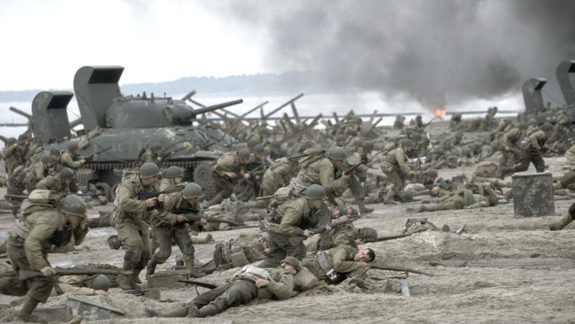
 Still from Saving Private Ryan, an example of an extreme grade adding to the story
Simon Wyndham argues that when grading, especially to an extreme, one should consider whether the grade will enhance or detract from the overall viewer experience.
Watch pretty much, well, anything on TV or at the cinema of any note (or even online right now) and the chances are it will have gone through a grading or gamma and colour correction process. Even on low budget works, it is par for the course. But can it be taken it too far?
All of our tools should be there to enhance the story of what we are telling on screen. Way back when we had films such as Pleasantville and O Brother, Where Art Thou?, the first major movie to be totally digitally graded. The looks that were created were pretty extreme and they served a fairly practical purpose.
Grading purpose
The look of a film should do just this – serve the story. But can it be distracting and/or pretentious? I was recently watching the final episode of the UK version of Wallander on the BBC and what struck me most was that the look and grade of the programme was distracting me away from the story. I couldn’t help but notice, continuously, how cold, grey and depressing it looked. Clearly, this was the purpose of the grade, but was it overcooked?
The person I was watching it with noted that she had never bothered to watch the programme before precisely because she hated how the picture looked in the trailers! Other people I have spoken to since have also expressed a similar view.
If the grade has actually started putting off viewers before they have even watched something, then you know that there is a problem! It breaks a cardinal sin in filmmaking that the practical elements of filmmaking should not be entering the minds of the viewers. They should work together as a seamless whole.
The Baked-in Approach
Before digital grading, various looks were used. One of the most prolific and popular looks at one time was the bleach bypass process, most starkly used by Steven Spielberg in Saving Private Ryan.
The process involved the internegative (usually) bypassing or partially bypassing the bleach stage of development. This results in the silver contained within the emulsion being retained, giving a desaturated look with reduced latitude, increased contrast and graininess.
Saving Private Ryan used the process effectively. It thoroughly suited the film and its gritty battle scenes. The process was also used much more subtly in the John Frankenheimer film, Ronin.
Those two films offer a good glimpse into the reasons why a look would be chosen and how best to use it. The same chemical process, with one much more extreme than the other. Spielberg wanted to recreate an old newsreel look, going so far as to use uncoated lenses while filming. The look was stark, but not distracting, because how it appeared suited the context of what we were seeing.
Ronin, on the other hand, used the effect much more subtly. Frankenheimer wanted a gritty look, maybe with some undertones of the spy thrillers of the past. But never does the look become distracting because realistic colours are retained.
This brings up an interesting thought process when comparing older films with newer ones. Before the advent of the Digital Intermediate, the look had to be baked-in while filming, through the use of filters, or be created chemically during the development process. Both options were potentially costly if they went wrong or didn’t work. So the creation of a look came along with a lot of thought beforehand.
Going extreme?
As the digital process has taken over the world, the various looks we see are often quite extreme and do not always serve the film well. We must remember that when we create something, we are serving our audiences, not ourselves. Do we want them to become immersed in our worlds or do we want them to notice the technical process that went into the creation of them?
That is not to say that I am against an extreme grade. But it must be considered how it serves a purpose, rather than pushing it because you want it to appear cold or warm. Your colour palette should begin at your set and costume design stages, not at the grade. This way you can ensure a consistent and production-suited look that has been thought through with intention.
Tags: Post & VFX


Comments