Replay: No one has criticised a film on the basis that is was shot on the wrong camera, or said ‘that would have been a great movie if they had only used Zeiss rather than Cooke lenses’.
As has been said at RedShark many times, all professional cameras today are capable of great pictures and, if your pictures don’t look great, it’s not because of the kit. Let me emphasise this point: I am not saying that the choice of cameras and lenses do not makes no difference – of course they do – just that you are not going to get the look you want just by buying the right brand, despite what manufacturers would like you to believe. Memorable, cinematic images have little to do with the type of kit you use.
The internet is obsessed with camera shoot-outs. If you are shooting a feature and have the time and budget to test and compare a whole range of equipment, great. Camera tests are very informative if your film consists entirely of a flatly lit young white woman holding a colour chart, otherwise there are better ways to spend your time.
But if it’s not about the kit, what is it that make pictures look great? Saying it’s the talent behind the camera is clearly true, but that’s not going to get us very far (because all of you out there know that you yourself are exceptionally talented). So here are some other things that are really essential for great pictures which have little to do with the kit.
Lighting

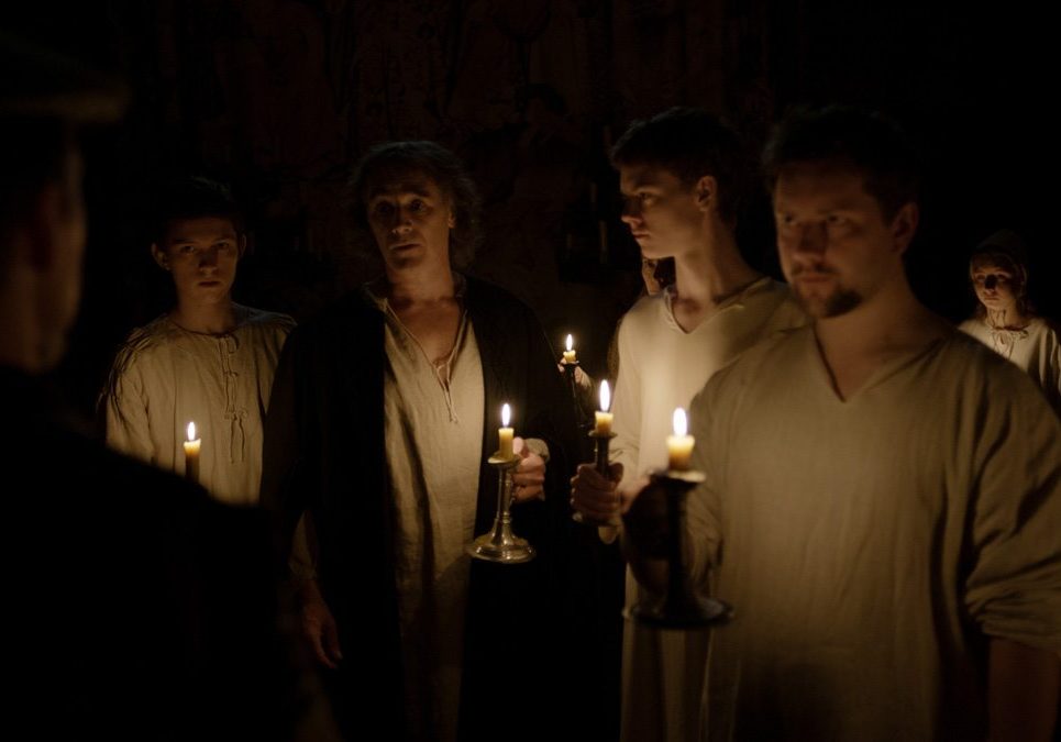
A still from Wolf Hall, lit by candles. Image: BBC.

So obvious I need hardly mention it – lighting is the key element for interior cinematography, but this is not the place for a lighting seminar. But you need more than your lighting skills and kit alone – you need space and you need the right location. The bigger your space, the easier it is to control your light and the easier it is to add depth to your images. Not only does light bounce around uncontrollably in small rooms, but the further your light is away from the subject the less the fall-off (the inverse-square law); a powerful light a long way away will light a space more evenly than a weaker light much closer. Ideally you want a space where characters can move in and out of light, where the shadows fit the dynamics of the story. If for dramatic purposes, you want one of the characters to always be in silhouette you need a location where that is possible and makes sense. In other word, choice of location is an integral part of great lighting.
Also, do not underestimate the lights that are not part of your kit – the practicals. Camera sensitivity and dynamic range has increased to the point it is now feasible to use practicals as source of light, not just set dressing. Or more often, candles, table lights, desk lights can determine the look of a scene, even if they need the subtle addition of fill or kicks.
Production Design

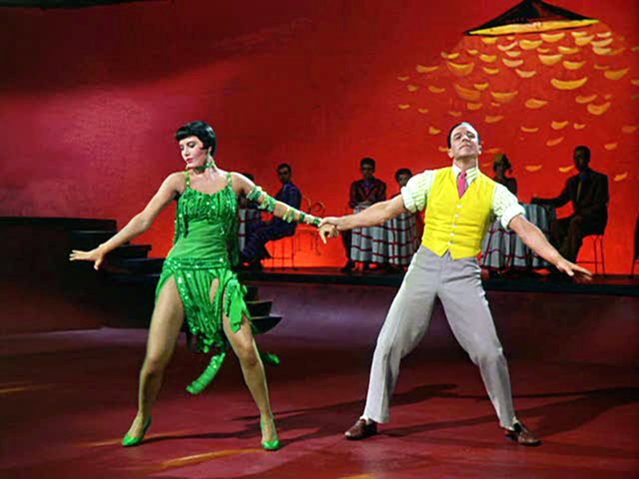
An American in Paris, MGM.

Audiences often mistake design for cinematography. Think of those glorious Technicolor musicals, and we think of bright, saturated colours. Yes, there is nothing quite like Technicolor (whose dye-transfer system was more like printing process than a photographic one), but part of that look was down to the sets and the costumes. Technicolor would always insist on a consultant on the set to make sure, well, Technicolor looked like Technicolor.
On the other end of the spectrum, the more pastel, sophisticated look of the European art movie cannot be separated from costume and set design.
If you are shooting in small rooms with white walls it’s very hard to make your photography look great. Here’s a trick – want your interiors to look classy? Paint the walls grey, a tone darker than Caucasian skin tone.
Location
… location, location. If you have a big budget you can build the set you want.
If you don’t, your choice is to find one. As I said already, small spaces are a nightmare for cinematography. It’s very hard to make small office spaces and suburban living rooms look great. So what do you do? If your money is tight, I would say avoid them or, if you can’t, avoid shooting in the day.
Cramped suburban living rooms and offices are dull locations. The best way round this is to avoid them altogether – it takes a lot of effort to make ordinary spaces look realistic but not boring. So often on features these sort of spaces are reconstructed in the studio, giving you the space to move the camera back and to have sunlight streaming through the windows.
Time of day
Getting up early or waiting for the light is something that is affordable when you have no money (it’s just yourself shooting) or huge amounts of money (you can afford to keep to pay overtime or keep a crew on standby). Sometimes it may be a just a case of planning things well. It’s no coincidence that so many camera showreels are shot at magic hour or dawn. It’s hard to make a sunset look drab.
The screenplay
North by Northwest. A great screenplay.
What, really? A good script makes better looking pictures? Well, yes. A film that has been conceived visually, that tells its story with action rather than words, is always easier to turn into great pictures. Read a really good screenplay, and the images spring out. When Hitchcock in North By Northwest decided that Cary Grant should be chased by a crop spraying plane in an open corn field rather than a mysterious stranger in a dark alley, that must have been a moment of joy for the cinematographer.
In fact, it is the coming together of all the above elements that creates great pictures. A screenplay that tells its story visually, a location that allows a mise-en-scène, where the positioning and movement of the characters helps to tell the story and allows lighting to mirror the tension in that story, in collaboration with production and costume design that enhance the look and mood – get all that right, and who cares what brand of lens is on what brand of camera.