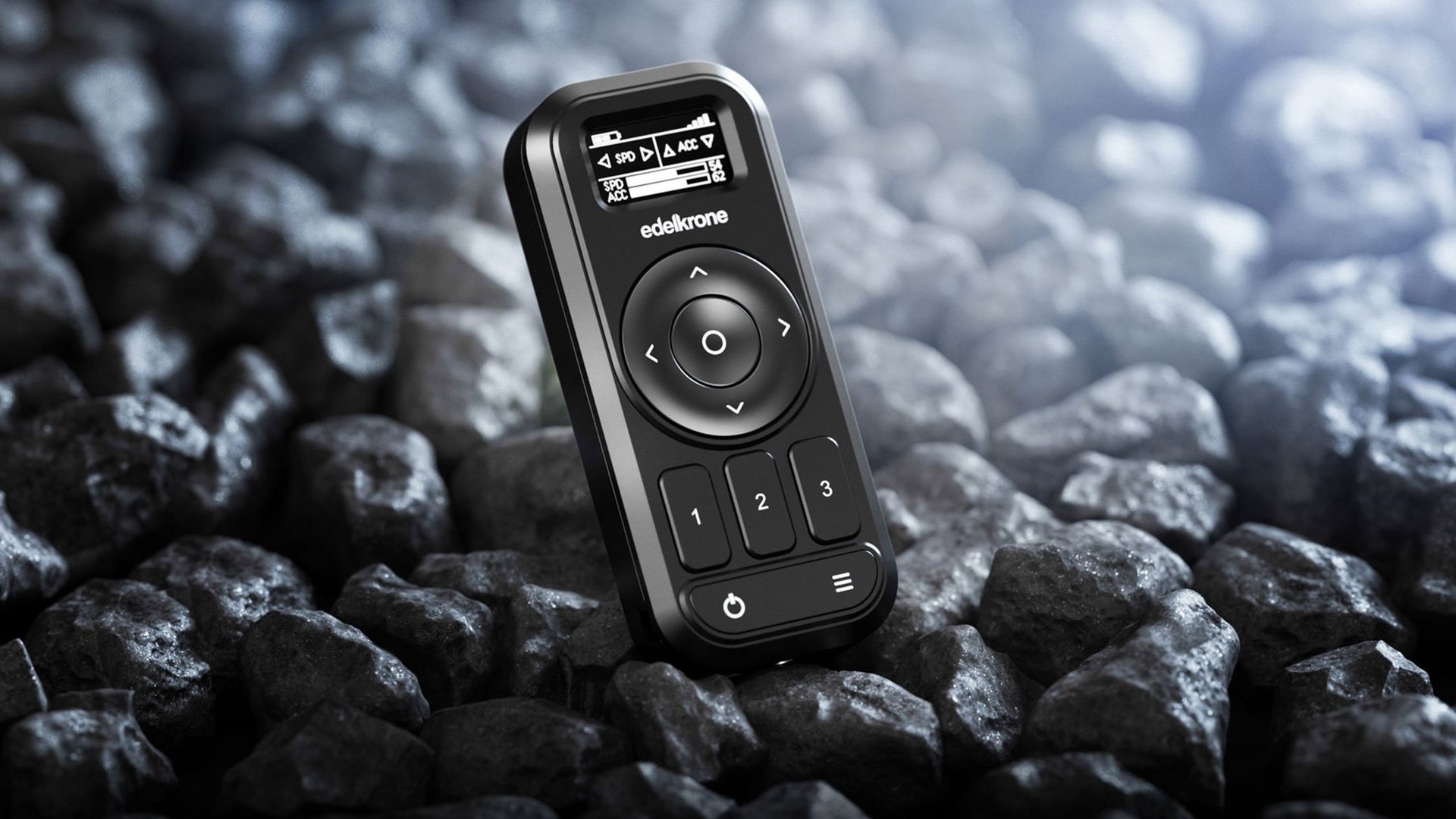
We review Edelkrone's Controller, a device that lets you control multiple motion control rigs in one device.

The Edelkrone Controller allows multiple devices to be controlled remotely. Image: Edelkrone.
For a few years now Edelkrone has been making products to give you more dynamic camera moves. It has expanded its product line steadily over time to give you more options, most recently adding jibs into its line up.
Control of its motorised products has traditionally been done through an app and whilst fully featured, tying up your smart device to control your motion control equipment can be awkward. This is especially true if you are using your smart phone to act as a wireless viewfinder for your camera or if you are using it to control other devices remotely.
Edelkrone aims to help alleviate this issue with the introduction of its new Controller (£127).
This little unit allows you to control a number of different Edelkrone products including sliders, heads, dollies, jibs and even focus motors.
Edelkrone Controller build quality
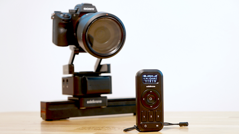
The first thing that struck me after taking it out of the box was the exceptional build quality. It appears to have been built to withstand a nuclear blast. The battery compartment lid is quite thin and attaches magnetically to the body. That doesn’t detract in any way from it’s function and it hasn’t fallen off once in my week of testing , and believe me I’ve tried shaking it about quite violently.
The controller uses two AAA batteries, a little unsual in the times of non replaceable lithium ion cells but welcome. With rechargeable 1100mAh cells and power save set to 30 seconds I was able to exceed the quoted figure of 4.5 hours of operation time by around 20 minutes.
Initially I set my SliderONE and HeadONE up as a pair, making sure both were powered on and booted up before powering on the controller. Pairing was painless; I just needed to select which devices I wanted to control. I then adjusted the slider and head using the 4 way selector and saved the poses using 2 of the 3 dedicated buttons. I was also able to control the speed and the acceleration of the move by pushing the centre ‘select’ button to bring up a secondary screen.
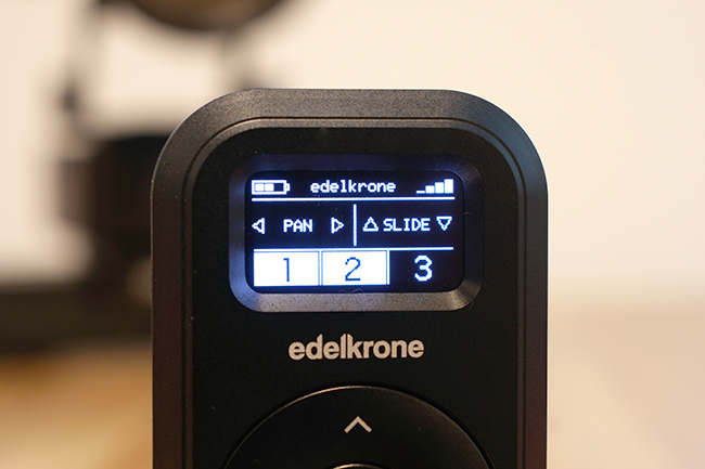
The Edelkrone Controller interface.
The controller only has a few buttons one of them being a menu button on the bottom right hand side; this brings up a number of options. One is called ‘advanced features’ which at the moment only has a single ‘Timelapse’ function. With the associated control cable I connected my camera to the HeadONE and using the controller I programmed in a time lapse.
The Controller prompted me for duration, shutter speed, interval and pose position, it then worked out the number of shots required and a final press and hold on the centre button set everything in motion. I should also add that it does take into account the acceleration setting when moving the camera in time lapse mode so if you have this set quite low you may think that the camera isn’t moving to start with.
You can easily check the battery level on the controller for any connected device using the menu. I found that once you have your poses and set your attached devices in motion you can power off the controller. This is especially handy for long time lapses. I successfully managed a line of sight range of 20m only limited by the space I had available, Edelkrone quotes a range of 25m, although initial pairing needs to be performed much closer.
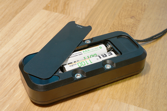
Edelkrone Controller battery compartment
There are some other menu options as well including auto power off and power save timings to help with battery life. It has an option to turn off the handy helper texts that are useful when using first starting but can become unnecessary after a while. It also has the usual a firmware upgrade menu, with the Controller you need to use the Edelkrone app to upgrade the firmware. During my week of testing I had three new versions of the main firmware and an update to the firmware for the internal radio as well.
There are some things that I think could be improved, the battery level readout is shown as a small 3 segment icon, I would like to have seen it as a percentage. This is also true for attached devices, in fact in a previous version of the firmware this was available but it has been replaced in the current version. It also arrived with an attached wrist strap, I think a lanyard would be much more useful here.
These are only small issues and it’s refreshing to see a dedicated remote product that doesn’t try to do too much. This could have easily ended up being another ‘smart’ touch screen device with a price to match – this time however it’s yet another example of less is more.
Tags: Production

Comments