
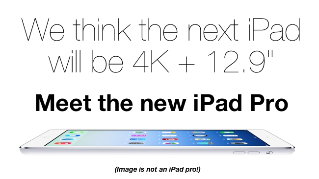
 iPad Air
The normally reliable Korea Times has reported that a 12.9 inch near-4K iPad is already being made. Here's more background on this and some other products that we think Apple will release during 2014. You read it first here! RedShark's K Stewart reports
By K Stewart
At this point in Apple’s product cycle, this season’s line-up is frozen and the doors to technology’s pre-eminent Dream Factory are closed tight. No more secrets to reveal. Not until Spring 2014 at the earliest.
This is the moment when speculation about new products, new ‘product categories’ can be at its wildest. There will be no real news for many months now.
An iWatch for Q2 2014? Absolutely; Inventec, Quanta and Foxconn Electronics are competing to build it for Apple.
27 and 32-inch 4K screens to partner the MacPro? Coming soon with AU Optronics panels using the embedded DisplayPort (eDP). Maybe.
iTV? Possibly not until 2015. Apple’s recent acquisition of 3D PrimeSense may take a little time to digest for that gesture-based interface, while 4K is still a little much for home broadband.
iPad Pro? Well, there’s the most mysterious mystery box of them all.
Rumours begin
May 2013 kick-started the most recent iPad Pro rumours with Korean website ETNews reporting a tier-1 Apple supplier was testing a 12.9-inch screen. A month later, the Wall Street Journal ran a similar story, while iPad News said Foxconn was testing a larger screen size (11.4 or 12.9 inches) in preparation for a March 2014 debut.
KGI Securities analyst Ming-Chi Kuo agreed a 12-inch Apple device was in development, but claimed it would be a new design MacBook Air with Retina display due in mid-2014, while Nomura analysts said the new machine would either be a 12.9-inch iPad or possibly a laptop-tablet hybrid similar to the Asus Transformer line or Sony's VAIO Flip models.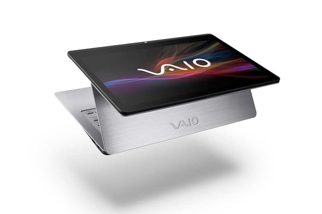
Sony's second generation VAIO Filp models are some of the best recent PC/Tablet devices
In November, the reputable Korea Times reported that production has already started on a 12.9 inch screen of near 4K resolution with an early 2014 shipping date. DigiTimes Sony’s second generation VAIO Flip models are some of the best hybrid PC/tablet models.claimed Quanta were building the 12.9-inch iPad but pushed the release data back into the middle of 2014.
The iPad/MacBook screen size confusion is perplexing. Touch-screen vs no touch screen, widescreen vs 4:3 aspect ratio. The most plausible explanation is that Apple is exploring a retina MacBook Air and iPad Pro in tandem.
Realising a vision
Just five months after the launch of the original iPad, with its paltry 256MB of RAM, Jobs made his famous prediction that “PCs are going to be like trucks. They’re still going to be around, they’re still going to have a lot of value, but they’re going to be used by one out of X people.”
“You might want to tell me the difference between a large phone and a tablet,” commented Google’s then CEO Eric Schmidt on the iPad’s launch, speaking for many skeptics. Joe Hewitt, who’d written Facebook’s iPhone app in 2007, had a sharper perspective as highlighted in Fred Vogelstein’s Google vs Apple ‘Dogfight’ book;
“I spent a year and a half attempting to reduce a massive, complex social-networking website into a handheld, touchscreen form factor. My goal was initially just to make a mobile companion for the facebook.com mother ship, but once I got comfortable with the platform I became convinced it was possible to create a version of Facebook that was actually better than the website! Of all the platforms I’ve developed on in my career, from the desktop to the web, the iPhone OS gave me the greatest sense of empowerment and had the highest ceiling for raising the art of UI design. Except there was one thing keeping me from reaching that ceiling: the screen was too small.
“iPad is an incredible opportunity for developers to re-imagine every single category of desktop and web software there is. … The bottom line is, many apps which were cute toys on iPhone can become full-featured power tools on the iPad, making you forget about their desktop/laptop predecessors. We just have to invent them.”
Apple set out this vision clearly enough with its own signature apps. iOS Garageband is simply one of the best music creation apps on the market, arguably even better than its desktop version, and very much in the prosumer space. Not your typical office worker at Apple’s Life on iPad.The flexibility of a keyboard-less, touchscreen device suit its requirements perfectly.
Tim Cook highlighted professional applications at the iPad Air launch with a short video now expanded into a Life on iPad website section. However, while impressive, these stories emphasise the edge cases, the exciting and creative uses a world away from most people’s office life.
iWork for professionals?
At the 2013 launch of the iPad Air, Apple obtained a lot of enthusiastic coverage for making the iWork and iLife software effectively free. In theory, you had to buy a new Mac or iPhone to qualify, or have bought a previous version of the software - however this has been very liberally interpreted, even including simply downloading demo versions.
The move was initially interpreted as a bold, aggressive attack on Microsoft’s Office empire, but this analysis frayed as it emerged the 64bit rewrites had, like FCPX’s controversial launch, resulted in significant features being left out. A belated support doc sets out a six month schedule for restoring some features, but it’s clear this wasn’t the ‘killer blow’ some had first thought.
Moreover, in context, the initiative looks more of a defensive move. Just as Apple Maps was prompted by the need to match Android’s exclusivity on turn-by-turn navigation in Google Maps, so iWork’s free pricing provides an answer to Google’s Quickoffice. Purchased in June 2012, the previously $19.99 app went free a month before the iWork update and during its first month Google bundled it with a 10Gb extra for a year. It also now comes as standard with KitKat and consequently any Android phone or tablet has Office functionality built-in.
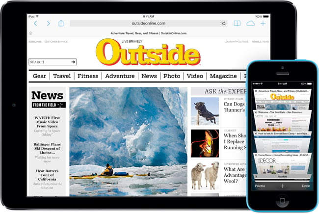
iWork is very good on iPhone and iPad but lacks features as a desktop app
Google has long offered its cloud-based Docs as an Office alternative, but Quickoffice showed the company didn’t feel this was sufficient. It needed and bought a company offering a first class native mobile app with robust Office file format compatibility.
And as part of a strategy to ease iOS owners’ path to Google/Android, Quickoffice also went free on iOS.
Microsoft’s iPad strategy is more complicated. Office 365 is tailored for iPhone use and only available to subscribers to that service. On iPad, users were expected to rely on the free cloud-based Office at Outlook.com.
Not the whole story
This isn’t the whole story, however, with The Daily reporting a sneak peek at Office running on an iPad back in February 2012. Developed by the Mac Business Unit it was set for release in a matter of weeks, but never actually materialised. Instead Microsoft launched its ‘iPad killers’ Surface RT and Surface Pro just four months later with Office as a key feature - free on the ARM-based RT model, while Surface Pro made do with a demo version as it can, of course, run any Windows program as normal.
In the past, Office compatibility has been an unstoppable strategic weapon for Microsoft and one of Steve Jobs’ first calls on becoming Apple CEO was to Bill Gates to ensure Office would be developed for OSX.
Frank Shaw, Microsoft’s Communications VP, reacted to news of the iWork price drop dismissively; “watered down productivity apps. Bolting on aftermarket input devices. All in an effort to convince people that their entertainment devices are really work machines.”
However, the Surface = Office line had already been dropped a month earlier by CEO Steve Ballmer speaking at Gartner Symposium ITXpo, “iPad will be picked up when there's a touch first user interface. That's in progress for Office.”
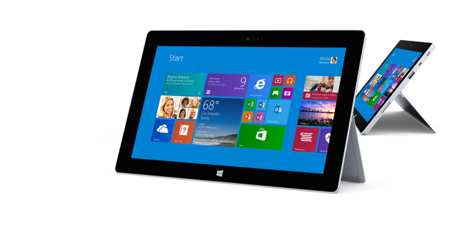
The future of Surface RT seems uncertain given a recent statement by Microsoft VP Julie Larson-Green
By November, Microsoft’s Julie Larson-Green, executive VP of Device and Studios, admitted RT was “our first go at creating that more closed, turnkey experience [like Apple has with iOS]… We have the Windows Phone OS. We have Windows RT and we have full Windows. We're not going to have three.
Steven Elop, former head of Microsoft’s Office division and a leading candidate to replace Ballmer, was reported by Bloomberg as keen to free Office from the need to promote Microsoft hardware.
Just as Microsoft Office played a key role at Steve Jobs return to Apple in 1997, so the old corporate "frenemies" might once again collaborate to launch an iPad Pro with Office as the headline act, compatible with iPad Air but looking best on iPad Pro's near-4K, 13-inch display.
If Microsoft can’t dominate the enterprise space with its own hardware, then working with Apple once again isn’t a bad plan B. Office, after all, isn’t just a massive cash cow in its own right, it’s the tip of a hugely lucrative Sharepoint/Exchange infrastructure that gets Microsoft in the front door for selling other services. Google, by contrast, is out to replace Microsoft completely and while it’s estimated only 13% of companies formally run Docs, how many employees rely on Docs as the default sharing system due to its ease of operation?
iOS 8?
While Office on iPad might have similar impact to The Beatles on iTunes - an indelible marketing message that’s sure to go mainstream, for most existing iPad users the key productivity issues relate to iOS itself.
iOS7 represented a dramatic visual overhaul, but its basic operation is much as it’s ever been for casual users; a grid of apps which open when touched and close when you press the home button. iOS’s simplicity is a defining featuring, and yet around this unchanged UX, Apple has evolved an ever more sophisticated array of ‘secret’ gestures, some of which have to be enabled with Control Settings.
One of the most powerful usability changes in iOS7 was the subtle addition of Spotlight search from any screen with a two finger downward swipe. Bigger folders and multi-tasking cards were more obvious visual changes, but Spotlight is now the fastest navigational trick.
Sharing data between apps remains difficult, however the situation is improving. Garageband has evolved to make sharing content much easier, again showing Apple leading by example, while Dropbox is almost certainly the best purchase Apple never made, a constantly improving cloud based file-system running on multiple platforms and supported by an ever growing array of iOS apps. Web-based service IFFT is helping evolve workflow possibilities across a range of devices, including iPad.
The rigorous sand-boxing of apps and data, the lack of an exposed file-system, are challenging for productivity, but then again the crippling anti-virus systems of corporate IT show the penalties of not getting it right.
There’s no sign, yet, of multi-user accounts - however it’s difficult to imagine a more perfect way of implementing it than via Touch ID seamlessly recognising different users as they touch the Home button and immediately switching accounts.
Split-screen windowing between apps or in a single app is a frustration for many professionals, journalists writing copy while referencing a press release, for example, are forced to swipe between screens rather than having single screen display.
Contrary to some commentators’ views, this is sometimes allowed by Apple. In 2011, a Kickstarter project attracted considerable publicity due to its promise of recreating the dual-screen UI of Microsoft’s canceled Courier project on iOS. Taposé eventually got through App Store approval in March 2012, but while a solid app it never quite lived up to expectations - in part because a 4:3 aspect ratio doesn’t give much space for a split-screen. Moreover, windowing even on Surface usually presupposes a keyboard is attached - without it the soft keyboard fills up too much of the screen.
A larger screen would obviously reduce this problem but not solve it, which naturally leads us to speculate on what iPad Pro might look like.
ePad?
To a large extent, Microsoft lost over a billion dollars with Surface betting on customers' desire for a keyboard. After all, in 2003 Steve Jobs had dismissed the entire tablet concept because “people want keyboards.”
Ten years later, Tim Cook had great fun with a road sign illustrating the confusion of rivals trying to turn laptops into tablets and vice versa. The idea of Apple ever doing any such a thing is utterly ludicrous.
Except that, of course, Apple pioneered the approach back in 1997.
The eMate 300 actually won plenty of praise for its imaginative re-imagining of the Newton PDA in a robust, translucent casing with built-in keyboard as an affordable laptop for the education market.
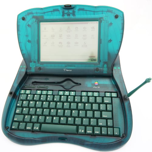
The eMate 300 still looks rather futuristic (Photo by NewTC UK)
A year later it was dead, killed off by Steve Jobs as he refocused Apple on survival above all else. However a key member of the design team, Jonathan Ive, went on to use many of its design elements in the hugely successful iMac and iBook ranges.
In October 2013, Tim Cook told shareholders Apple had an unprecedented 94% share of the educational market for tablets… but as Cook also knows, it’s early days as yet.
In Los Angeles, the $1 billion roll-out of America’s largest investment in iPads for education is under review with laptops being studied as an alternative, due in part to an unforeseen extra $38 million required to cover the cost of wireless keyboards recommended for new state standardised tests.
Education has always been a core market for Apple, and aside from the annual back-to-school promotions and university discounts, there’s been an ongoing attempt to serve it - even if that meant custom hardware such as the all-white eMac (education Mac) and for a time keeping in production the white MacBook exclusively for education customers.
Larger screen + polycarbonate housing
An iPad with a larger screen, a robust polycarbonate housing and integrated keyboard could turn Apple’s early lead into something more substantive. It’s certainly notable that amongst the 2013 line-up, the products most suited to education such as the robust iPad 2 and MacBook Pro (non-retina) are the ones likely to be retired in 2014.
iPad Pro for education would likely be ‘proudly plastic’, but profitability suggests Apple will start with the iPad Pro as a higher end, higher margin product. A 4K screen won’t come cheap.
With Surface, Microsoft started with a tablet-sized screen then worked out from that to add a keyboard and, this year, a dock for external monitor, keyboard ethernet. While impressively engineered, ultimately it gave users a choice between a powerful x86 13.3-inch conventional laptop and something smaller, more expensive and difficult to use in your lap with a keyboard. It’s a tough sell.
Starting with a 12.9-inch screen might lead to a more successful outcome. Prior to the launch of the iPad Air, there were rumours Apple might release its own take on the Surface low-profile keyboards. After all, when the original iPad launched, Apple shipped an imaginative keyboard dock that remains the best exploitation of the 4:3 screen.
In 2014, the magical lightness of the iPad Air could be matched by an Apple keyboard/case than makes the iPad Pro an irresistible choice for Office work. Genuine “ice water in hell” - at last.
The next revolution…
The original iPad sparked a transformation in personal computing by increasing screen size from 3.5-inch to 9.7-inch. The next step has similar if not greater potential if it provides the apps and the accessories to challenge the low-end laptop and desktop market.
However magical the iPad is, not all the laws of physics can be entirely bent to serve its purpose. A 9.7-inch screen simply can’t contain a workspace with rich editing tools and a secondary document, particularly not when fingers demand larger buttons.
If iOS is to continue evolving, 2014 seems a good a time as any for the next step forward. Canalys predicts 2014 will be the year tablet sales match those of the PC, but with Apple’s share declining. The one certainty is if Apple doesn’t continue to innovate, its competitors will not hesitate to take its customers.
Additional information
This article was initiated in Daedalus Touch/Ulysses on iPad/MacBook, then outlined and initially composed in Scrivener on MacBook, before final assembly in Pages on MacBook. Then checked on Pages on iPad. [Outlining aside, Pages is already a pretty decent long form production tool.]
By K Stewart
Tags: Business


Comments